Busy streets are visual battlegrounds. Between traffic signals, shopfronts, scaffolding, and constant movement, most messages disappear into the background within seconds. Outdoor fence graphics challenge that reality by turning temporary boundaries into deliberate communication tools. Instead of acting as passive barriers, fences become active brand surfaces that shape perception, signal intent, and attract attention in places where attention is hardest to earn.
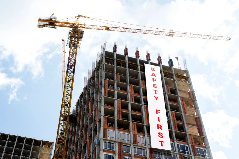
This shift is particularly valuable for construction projects, pop-up developments, and urban refurbishments, where first impressions are formed long before a site opens to the public.
Urban streets are saturated with competing stimuli. Pedestrians glance, drivers scan, and decisions are made subconsciously. Outdoor fence graphics operate at eye level, where attention naturally rests, making them far more effective than elevated or distant signage.
When heras fencing banners are installed along pedestrian routes or roadside perimeters, they intercept attention at precisely the moment people are most receptive to visual cues. This makes them ideal for areas with heavy footfall or slow-moving traffic.
Temporary fencing is often viewed as a necessary inconvenience. However, with the right graphic treatment, it becomes a strategic asset. Fence graphics introduce colour, clarity, and structure to otherwise disruptive environments, helping projects feel organised and intentional rather than chaotic.
This transformation improves public perception and reduces the visual fatigue often associated with construction-heavy areas.
Repetition is a powerful psychological driver. When people pass the same site daily, consistent visuals reinforce memory without requiring conscious effort. Outdoor fence graphics work continuously, delivering repeated exposure that builds familiarity over time.
Using heras fencing banners across extended perimeters ensures visual consistency, allowing messages, colours, and layouts to become recognisable landmarks within the street environment.
Fence graphics are often the first interaction the public has with a future space. They communicate what is coming, who is responsible, and why the project matters. This early storytelling reduces uncertainty and creates anticipation, particularly in regeneration zones or mixed-use developments.
Clear messaging also helps manage expectations, which is crucial in long-term projects where disruption is unavoidable.
The most effective fence graphics are informed by disciplines outside traditional construction signage. Sectors such as healthcare, hospitality, and retail understand how spatial design influences trust and comfort.
For example, professional services like a dental practice builder place heavy emphasis on clarity, calm visuals, and intuitive communication. When these principles are applied to outdoor fence graphics, the result is signage that reassures rather than overwhelms.
This crossover demonstrates that whether designing a clinical interior or a street-facing perimeter, the goal is the same: reduce friction, build confidence, and guide perception.
Well-designed fence graphics suggest competence and planning. In busy streets, visual order stands out more than loud messaging. Balanced layouts, readable typography, and structured information communicate professionalism long before a project is complete.
This approach mirrors the way thoughtfully designed clinics or commercial interiors signal quality before a single interaction takes place.
| Factor | Fence Graphics | Free-Standing Signage | Digital Outdoor Ads |
| Visibility Duration | Continuous | Limited | Time-based |
| Cost Over Time | Fixed | Variable | Ongoing |
| Street-Level Impact | High | Medium | Medium–High |
| Customisation | Full coverage | Limited size | Creative limits |
| Physical Presence | Integrated | Add-on | Screen-based |
This comparison highlights why fence graphics deliver strong value in high-traffic areas, particularly where long-term presence matters.
Durability is essential. Outdoor fence graphics must withstand wind, rain, and UV exposure without degrading. Mesh and reinforced PVC materials allow airflow while maintaining print clarity, ensuring safety and longevity.
Strategic placement matters as much as design. Graphics should align with natural sightlines, entrances, and pedestrian pauses such as crossings or bus stops. This ensures messages are absorbed rather than glanced at and forgotten.
Using heras fencing banners consistently across the site avoids visual breaks that dilute impact.
Outdoor fence graphics are no longer decorative extras. They are tools for communication, reputation management, and place-making in environments where attention is scarce. By applying design principles borrowed from people-focused sectors and treating temporary boundaries as meaningful surfaces, projects can stand out without shouting.
In a city that rarely slows down, the most effective messages are not the loudest, but the most considered. Fence graphics that respect context, guide perception, and maintain clarity turn disruption into opportunity, proving that even temporary structures can leave a lasting impression.
© 2026 Point of Sale Printers. All Rights Reserved.